As we step into a new year, many of us are filled with aspirations of building a future on our own terms. For those venturing into the world of entrepreneurship, one of the essential steps is creating a solid brand compass. This invaluable tool serves as a guiding star, helping you navigate the path to success by defining your ideal client and shaping your business strategy. Within this brand compass, lies a crucial element: your logo. While some may opt to delegate the logo design to a graphic designer, I strongly recommend taking an active role in the design process. After all, your logo will be the face of your business for years to come, and being involved ensures that it truly resonates with your brand’s essence.
1. Less is more
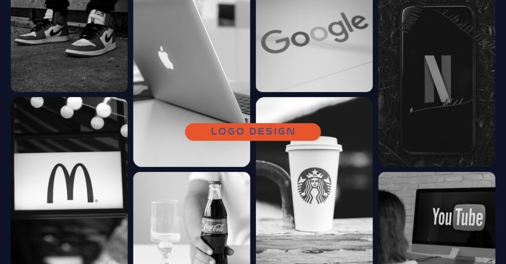
When it comes to logo design, the age-old adage holds that less is more. It’s crucial to avoid cluttering your logo with excessive elements. Take a cue from iconic brands like Nike and Apple, whose minimalist logos have become instantly recognisable worldwide. By keeping your logo simple and streamlined, you ensure that it remains visually appealing and memorable.
Additionally, it’s advisable to limit the colour palette of your logo to no more than three colours. This not only maintains a clean and cohesive appearance but also enhances versatility across different mediums and platforms. Remember, simplicity and restraint can go a long way in creating a powerful and timeless logo.
2. Finding Inspiration
When seeking inspiration for your logo design, don’t limit yourself to just looking at other logos. While exploring existing logos can be a great starting point, inspiration can be found in the most unexpected places. Pay attention to the world around you, from the colours of a flower to the shapes of everyday objects. Brainstorming sessions can also help generate ideas and concepts. Consider your target audience and their preferences, inviting input from colleagues, friends, and business associates to gain different perspectives. Mood boards can be a valuable tool for visual thinkers, allowing you to gather images that resonate with your brand and contribute to your logo’s style and design elements.
3. Black and white
It’s essential to request the initial draft of your logo options in black and white. This approach serves a dual purpose. Firstly, it ensures that your logo maintains its visual appeal even when printed or displayed in black and white. By examining your logo in this simplified colour scheme, you can assess its clarity and legibility, guaranteeing that it remains impactful across various mediums and printing methods. Moreover, considering scenarios where branding techniques like laser engraving are employed, a black and white logo eliminates any potential difficulties, as it translates seamlessly onto different surfaces. By prioritising the effectiveness of your logo in black and white, you establish a strong foundation for its versatility and longevity.
4. Unique or Not
Once you’ve received the draft of your logo from the designer, it’s crucial to take an extra step before making your final decision. Conduct a thorough Google Image search to ensure that your logo is truly unique and original. This precautionary measure helps you avoid any potential issues of plagiarism or inadvertently using a logo that already exists in the market. By doing this search, you can verify that your designer hasn’t simply taken an existing logo and made minor modifications to it. Ensuring the uniqueness of your logo not only protects your brand’s integrity but also helps you stand out in a crowded marketplace. So, take the time to verify the originality of your logo before proceeding with its selection.
5. Colour
Colours play a vital role in logo design, as they have the power to evoke specific emotions and associations. It’s essential to understand the meaning behind different colours and how they can effectively convey your brand’s personality. Consider the following popular colours and their connotations:
- Red: Represents fervour, excitement, and appetite. It is ideal for brands that want to stand out and convey energy.
- Orange: Vivacious, energizing, and fun, orange is a less common but impactful choice.
- Yellow: Creates an approachable and friendly vibe, radiating happiness and youthfulness.
- Green: Adaptable and versatile, green can be used for various brand identities, particularly those connected to nature.
- Blue: Classic and trustworthy, blue represents maturity and calmness, making it a popular choice for many brands.
- Purple: Symbolizes opulence and can convey mystery or femininity, depending on the specific hue.
- Pink: Perfect for feminine brands, pink can evoke both maturity and youthfulness, depending on the shade.
- Brown: Ideal for vintage logos, brown can give your brand an aged and handmade appearance.
- Black: Sleek, contemporary, and luxurious, black is a timeless choice that exudes sophistication.
- White: Creates a streamlined and minimalistic look, adding a fresh and modern touch to your logo.
- Gray: Conveys maturity, class, and seriousness, with lighter shades offering accessibility and darker shades adding an enigmatic touch.
When selecting your colour palette, choose wisely, considering the emotions and associations you want to evoke in your target audience. Coolors.co is a great website to explore various colour palette options and find the perfect combination for your logo design.
Remember, a logo is not just a visual symbol; it is the jewel in the crown of your brand’s image. Invest time and effort into designing a logo that resonates with your audience, communicates your brand’s values, and leaves a lasting impression.

